With the freedom to code design tools, the software landscape is shifting. In this conversation, Martin and Tim unpack arising questions: What exactly defines a good tool? Are modern ecosystems empowering us, or are they dictating our creative boundaries? Where is the room for “inspirational mistakes”, the jazz of design, when software only sees us as users and not as living systems?
Martin: Hi Tim, are you up for another conversation about tools? It has been a while since we had our last written conversation. In the meantime we did a huge project for Porto Rocha, a custom coded tool for Coinbase. It made me think about what a tool is and which are its limits.
Tim: Great idea Martin. I’ll give us something to think about: In visual design, we are currently experiencing a massive landslide where multiple things happen at the same time: The major player gets challenged by new competitors. No-Code tools enable designers to do work that was done by coders before and AI enables anyone to develop software: applications and tools that are only built for a single use case. Often this is referred to as disposable software, tools that have been built either for a real use case or for experimentation and then get obsolete and forgotten at some point. I often feel like a tool was a silo five years ago: There were specialized applications for cleanly separated fields. Now, the borders around these silos dissolve and we don’t know where this will lead us…
“As I see it, us creatives being able now to create our own tools is a huge step forward … or, looking at people like Müller-Brockmann, back to the freedom we had.”
Martin: Yes, I feel that shift too. I started designing with QuarkXPress and Freehand, then had to shift to InDesign and Illustrator, now maybe Figma and Canva will take over. None of these changes of software felt necessary from the design perspective. If you look back at pre-computer designs, they were often better than what we do today and I think this has something to do with the creative freedom a tool provides. Let me give you an example. I suppose you and every one of our readers know the fantastic posters by Josef Müller-Brockmann. He mastered grid systems as a tool to create designs that balanced order and chaos. The grids gave the design order, creating a pattern that feels right for us, like a beat in a song, but then he got playful on top of that grid, like a jazz musician would start improvising, create tension through interesting compositions or highlight certain information for the reader. Order and chaos, grid and composition, tool and its user, are in dialogue with each other. One can’t live without the other. One can’t be created on its own either. If Müller-Brockmann would have always taken the same grid, all the posters would look more alike. Which brings me back to nowadays design tools. Which design software allows you to create your own grids? I mean really be creative with them, like Müller-Brockmann was when he used diagonal or even circular grids in his Musica Viva posters from the 1950s? This is where I see the limits of pre-fabricated design tools. It is a technical limit, but also a creativity limit. We are limited by the developers’ creative limitations. Müller-Brockmann used a compass and ruler. These tools seem simple, but they actually give far more creative freedom than our digital tools. As I see it, us creatives being able now to create our own tools is a huge step forward … or, looking at people like Müller-Brockmann, back to the freedom we had.
“Mainstream design tools dictate a 4/4 beat and a minor scale. There is no Jazz in them.”
Tim: That makes so much sense and reminds me about my shift from Apple to Linux a few years ago. It felt a bit like moving from Digital to Analogue – a lot of software simply did not exist in the Linux world and this forced me to invent workarounds and eventually code little tools myself. This of course required learning, but the process of building a small, sharp tool for a specific use case is mostly joyful for me! All the creative decisions along the way create a genuinely personal creative language. I love that you mentioned Josef Müller Brockmann’s Grids and how this transfers to the development of custom tools. The tool is the grid and determines the rules. You also mentioned Jazz music – the scale, the chord progressions and the rhythm in a jazz tune are the grid, the musicians improvise on top of that framework. Mainstream design tools dictate a 4/4 beat and a minor scale. There is no Jazz in them.
“I wish tools would treat us less like users and more like creative beings.”
Martin: I like that claim: There is no jazz in Canva. Haha! But there is a big truth in that. Software is often so rigid it does not let you make inspirational mistakes, you just make functional errors. You either do it right or wrong. It works or it doesn’t. When you draw with a pen, a wrong stroke might lead you to a completely new idea. There is this story by Herbie Hancock playing with Miles Davis. Hancock plays a wrong note, but by Davis picking it up and contextualising the wrong note in a different way, he made it sound right. To Davis a mistake was an invitation to become creative. I wish tools would treat us less like users and more like creative beings. This is the real challenge when designing tools: To design creative workflows in which these tools are embedded.
“A well-made tool is humble; it knows its place. It’s small, and it’s sharp.”
Tim: Exactly! But there is one thing I would like to pick up: I don’t think that tools like Canva are too rigid. On the contrary, mainstream tools are so versatile that they get confused with the workflow. They hijack and monetize the whole process, instead of integrating into it, as you wrote. For me, in a perfect world, there would be broad adoption of meta-tools – tools to build tools – paired with a downgrade attitude – a mindset of ingenuity that generates elegant artifacts, enchanting through structural minimalism. A well made tool is humble, it knows its place. It’s small and it’s sharp. It helps people to do good, collaborative work.
“They came to us because they only got so far with vibe coding. The moment they were trying to further develop the tool, they recognized it became very fragile.”
Martin: So true! This is a great segway to talk about the tool we developed for Porto Rocha and their client Coinbase. They came to us because they only got so far with vibe coding. The moment they were trying to further develop the tool, they recognized it became very fragile. Not all agencies are smart enough to see that. Porto Rocha plays in a league where you need to deliver solid products and not wanky stuff that can break easily.
“One tool as a single source of truth.”
Tim: I think the whole setting was quite ideal: Porta Rocha had already thought out of the box (i.e. the Creative Cloud) right from the beginning. They have designed a workflow where the client becomes a part of the design team and the brief was to develop a tool that can be used both inhouse at coinbase as well as in the agency. One tool as a single source of truth. It encapsulates fundamental parts of the visual identity. We have built a bespoke, tailored design software that covers a broad spectrum of output formats for various environments: The standalone app can handle frictionless video export in .mp4 format, a seamless switch between vector and pixel graphics rendering and 3D animation.
“From the perspective of the Identity Design it is a strategic decision to limit the options. Limiting the options means more visual consistency and easier identification.”
Martin: Working on the tool revealed essential questions to tool-making, such as: How much freedom do we give the user? From the perspective of the Identity Design it is a strategic decision to limit the options. Limiting the options means more visual consistency and easier identification. We all have our personal tastes and like to challenge the tools we are working with. Isn’t it fun to misuse your tools? To make an identity work we need to limit our playfulness to the parameters of the system, if we do not want to lose the identity. You could call these tools “Unifying Tools” or “Tools for Consistency” to make a differentiation with the tools you use to create identities. At several moments in the process we were tempted to add more and more features to the tool, but this would have missed the point of the tool. It makes no sense to recreate After Effects or Cavalry. Its purpose is a different one.
“A great tool is a piece within a larger system. The tool needs a clear purpose that makes sense.”
Tim: Yes, exactly, I think many projects these days start ambitious, driven by anxiety. No wonder, the world around us tells us to run, shout, scale, amplify. All this is bad design. Bad design creates bloat and noise. Bad design is driven by individual ambition rather than elegance and simplicity. A great tool is a piece within a larger system. The tool needs a clear purpose that makes sense. Sometimes the MVP is already the best solution.
It’s tricky to communicate this to clients. Often the premises and incentives are not unified within all team members. I am glad that we discuss this together often and set out to find appropriate language. Just like now.
Porta Rocha and Coinbase were the ideal clients for us. Everything was in sync, the brief, the relationship, our mutual trust. It was a great experience.
Martin: Yeah, I think we are all very proud about the result, which wouldn’t have been as good if the workflow between all of us wouldn’t have been that smooth. Big kudos as well to Julian Hespenheide who worked with us on the project. It was a complex project with its challenges and took several months, but we managed to keep it as efficient as possible. No missed deadline. No work-weekend. Now that we have talked so much about tools and THE tool for Coinbase, we have to show it to the reader, if he/she hasn’t scrolled down already. 😉
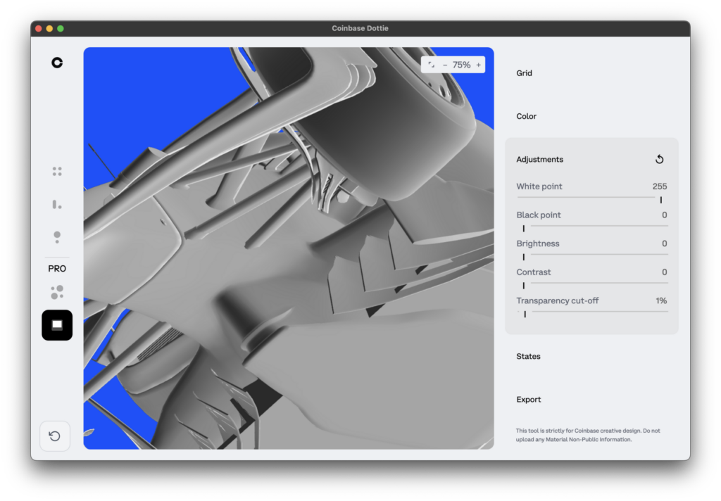
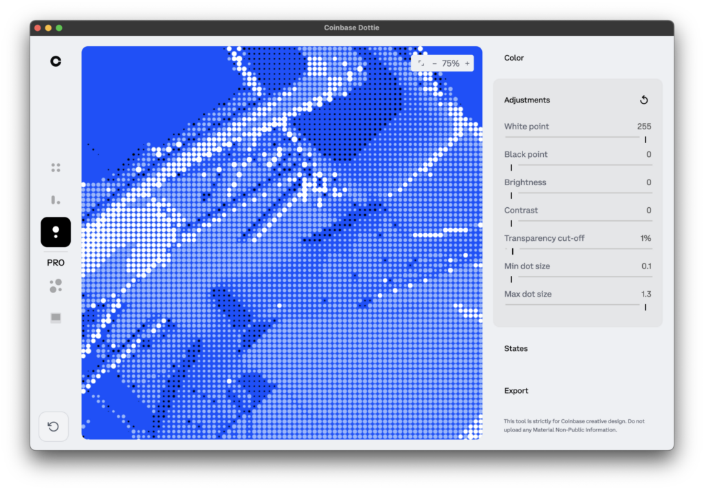
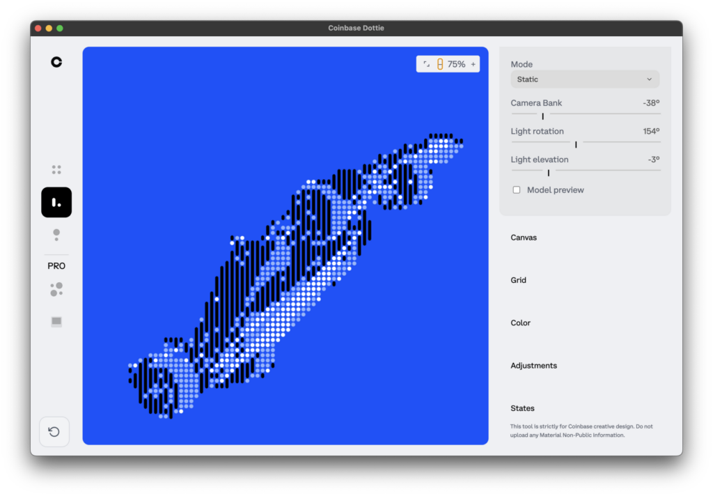
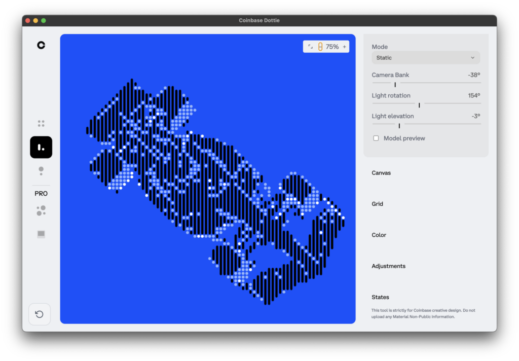
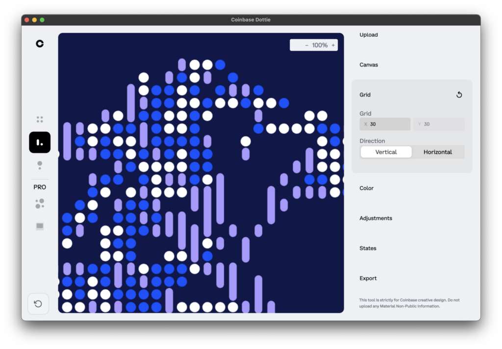
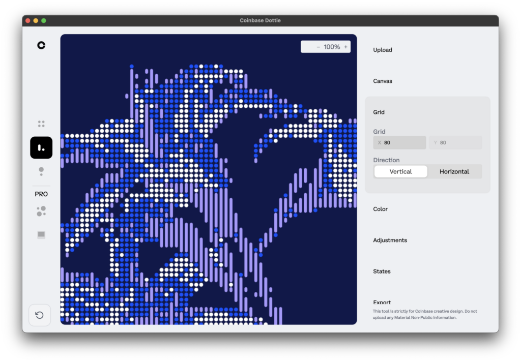
Tim: I think Julian was the perfect fit for the project. I have been a big fan of his work for years and I look back on a process where he again and again stated the right, sometimes inconvenient questions. He challenged the design from an engineering perspective and this is only possible in a team with flat hierarchies and unconditional trust. From Porta Rocha, I remember hearing often the phrase “we are not building a second Adobe here”. So in the whole project, we had a shared goal of structural simplicity. We all spoke the same language. I find it worth mentioning that we did not involve AI in the coding process. When we mentioned that on the side in one of the meetings, our partners expressed their relief. I did not expect such a strongly voiced appreciation of that stance that may appear conservative to some at first glance.
“I find it worth mentioning that we did not involve AI in the coding process. When we mentioned that on the side in one of the meetings, our partners expressed their relief.”
Martin: Absolutely. Let’s stop our conversation here and rather pick it up in a follow-up conversation and the full case study of the Coinbase project (Coming soon!)
Published on August 13, 2026
Last updated on September 19, 2026